Re: Crisis Point: Extinction - Metroidvania H-game - NEW PUBLIC UPDATE! (Oct. 25th)
You'll have to forgive me if some of these things have been addressed before, I don't have the time or patience to browse 20+ pages of posts that may or may not be addressing the things I'm interested in. First, quick background on me for those who don't read introduction threads. I am a professionally trained software developer on the artsy side of things; I make things look pretty and that's the quick version.
Diving right into my impressions,the build felt very thin. I wrestled with this bear for a little while as my conventional wisdom was telling me that the resolution was just too large. I would be working somewhere around 320x256 or the classic SNES resolution of 256x224 for a more authentic feeling. The more I thought about this, the more I realized that a higher resolution meant packing more detail into H scenes. So I no longer feel that resolution alone is the cause for this gaunt feeling.
This turns me toward filling this massive screen space, and crafting the environment. I've read that you've got an environment artist on staff now. I'm not sure how much work he has been able to contribute towards the current build but I imagine improvements are on the way. I also understand that doing absolutely everything yourself is incredibly time consuming so something has to suffer for it.
That being said, the environment needs some dramatic work. The overall structure-level design is solid enough; however everything is an incredibly jarring shade of purple and green. The nice parallax effect from outside is completely abandoned once we enter the cave, which I was disappointed to see. There isn't enough going on in the environment to make it a convincingly atmospheric location.
The UI in the top corner needs to be churched up a little as well. It's larger than it needs to be for the information it provides and it's purple. There is already a lot of purple onscreen at any given time inside the cave.
Now, instead of just complaining about it and leaving it at that, I will be proposing some solutions to the issues I've raised:
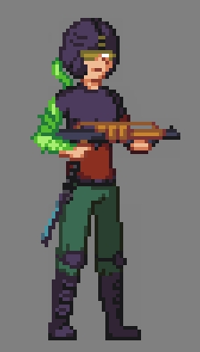
Getting rid of the thin feeling- Packing the screen with more activity is a big first step. I would immediately increase the size of the character sprites. You've got a lot of screen real estate to work with so use it to make your characters larger and more detailed, their activity is the focal point of this genre. Setting your main character's sprite to around 100x35 has her filling adequate screen area. I would try to widen her just a tad as well.
UI boringness - Making an interesting and unobtrusive UI can be difficult, but there's a lot to work with as far as style goes. If you must have some sort of physical panel up there, working with some sci-fi styles could make it pop and provide useful information without looking like a purple handlebar. I've got a design in mind that might work for it if you're interested in taking a look some time.
Environment- Ditch the purple and blue green confetti ground. The background needs some solid earthy tones and more rock like formations. Each area needs to have it's own 'flavor' along with it's level design. Research into old background art and pictures of environments work wonders for coming up with dynamic and interesting backgrounds. I'll be interested to see what your environment artist comes up with in the next build. Aside from that I'd be happy to doctor up some screenshots in the future to demonstrate some background work.
Palette control- This is a relic from people like me who have been playing games since the Commodore 64. I would keep tight control on what colors are possible throughout the game. Palette control will enforce cohesion with all of your characters and their environment by drawing from the same well of colors. I pulled up a screenshot from the outdoor environment and had a count of 256 colors, many of them were nearly identical in HSL. Shoot for a nice 64 color palette, like the NES palette, (which only actually has around 57 colors) fill in some of its gaps with some custom colors that read well with the it and lock all of your artwork to that index. An optional step but one I can't recommend enough.
You've got a fun little game shaping up here and fleshing out the world in which it takes place will see a major boost of quality. I'd be more than happy to lend my expertise from time to time in asset creation as well, after all it is a big job to undertake. Looking forward to the next build!
First off, thanks for the in-depth look. Must have taken a while to write, and I appreciate the effort.
Now on to the replies, in order of the things you brought up:
Filling screen space. I can assure you right now that the environmental art is nowhere near done. The basic tiles for the ground and walls and such are the only things I would consider complete at this stage. You mention the parallax being abandoned, and while it may seem like that now, I do have plans to bring it into the cave. Keep in mind however that the three layers of parallax in the grassy overworld are built with the intention of giving it a vast, open feeling - the caves by comparison are a more compact area, and heavy parallax would make it seem much larger than it really is. Regardless, I'm not abandoning it, just haven't added it in yet.
As far as the little bits and pieces that will be in the environment, such as plants and flowers and what have you - they just aren't there yet. They're very important to the overall atmosphere, yes, but at the end of the day they
are just fluff. The gameplay doesn't need them to function, so designing them at this point in development isn't necessary. There are other things that are more important to focus on right now, and later in development you'll start to see a lot of artistic fluffing up.
I can't say I agree with you on the UI's size. In comparison to the screen, it hardly takes up any space. Making it any smaller would also make it less readable, which would hardly make for good gameplay. As for the colors, though, I had a similar feeling myself when I was designing it, but I chalked it up to my being overly perfectionist considering everybody I showed it to loved it. I'd be happy to look at your design idea - no guarantees I'll be using it, but I wouldn't mind touching up the UI at all, if I can get a solid idea for it.
Getting rid of the thin feeling - I have to disagree with you heavily on this one. Alicia's size far from dominates the screen, yes, but it also allows ample room that classic games just didn't have. One major fault of 2D gameplay is that there's simply not enough room to see what's going on around you, and if I make her bigger to fill up more screen, then I fall into the same trap. I'm not trying to accurately recreate SNES conditions, like you mentioned. That's not the goal here.
In addition to that, the entire environment - and all of the artwork - is based around her sprite's size. If I make her bigger, not only is that a
massive undertaking for me, with several dozen animations to completely redo, but the entire world would need to be redesigned as well. It would take me months to catch back up to where I am now, and it's something I really don't feel is necessary to begin with.
As far as it being an H-game, that's what the screen zoom is for. Yes, making her bigger would allow for more sex scene detail, but there's already plenty of room for that - the game isn't exactly low resolution - and the screen zoom during sex scenes does the job of making it the focal point.
Gotta disagree with you on the environment, too. You're saying earthy tones, but Crisis Point is set on an alien world. Earthy tones are the exact thing I
don't want. I'm not trying to make this look like a place you can relate to. It's unorthodox, unfamiliar, and alien - exactly what it should be. Now, if you don't think it gets that point across, that's another story entirely - but you were describing it as if you just didn't
like it. That's fine, but it's also subjective criticism and not necessarily something that needs to change.
I'd also like to point out that the colors in the cave environment currently form a complimentary color triad - purple, green, and yellow. There's not much yellow, currently just the glowing light plants, but there will be more of it in due time.
With the color palette limitation - again, that sounds like I'm trying to recreate classic games. I'm not, though. I'm creating a game with more powerful hardware in the
spirit of classics like Super Metroid, not trying to recreate them entirely. That's not to say palette control is unimportant, because it most certainly is, but limiting myself to 64 colors - just slightly higher than the NES palette, which is an 8 bit system - would be asinine. Color palette cohesion, yes. That's probably something I can do more of. Color palette
limitation, on the other hand.. nah.
In any case, I appreciate the time you took to write all of that up. It shows that you think the game has potential, so thank you! I certainly wouldn't mind taking a look at some examples of what you have to offer in terms of asset creation, but I wouldn't be able to pay for it at the moment - money is tight. If your examples impress me though, perhaps I'd be able to do so in the future. In the mean time though, thanks again for the in-depth look, and I'm glad you like the project!
")