What's new

UOU's Game devolopement area


UrineOnU

Cthulhu
Joined
Feb 2, 2011
Messages
369
Reputation score
40
I've just begun to start post production of a game,I'm slowly narrowing down what I've got planed to do, it won't be a action adventure with amazing replay value of any kind but it'll be similar to a Actraiser style clone without the sim stuff so it'll be more like Actraiser 2 as a game a action platformer.

The story is Basically you are a soul of a long dead goddess who reawakens when you have begun to be worshiped once again. She sends her essence down to the earth to save your followers from evil beings by transferring into a female war god statue.

Their will be health upgrade collectibles maybe magic too but no leveling or backtracking the game will be very simple.

My plans for mechanics are:

Running,jumping,ducking,basic attack on land and midair,long range projectiles or magic that are collected in levels.

For the erotic aspects I'm thinking about only on defeat(life=0), It will also prompt a continue or if you lose all lives a game over.

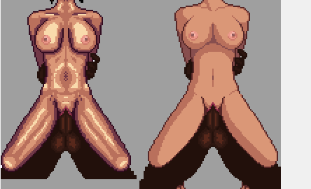
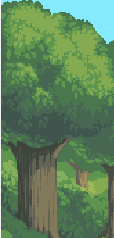
If I'm feeling up to it I'll make large scale animation 1 for each level for the game over.It'll be around this size and quality
this is not for this game but it give a little idea of what i'd be like.

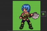
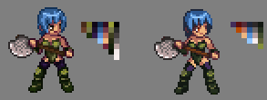
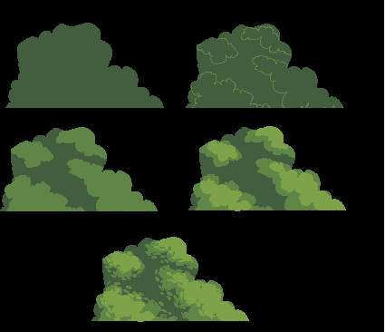
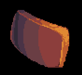
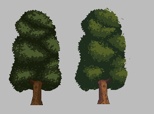
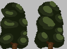
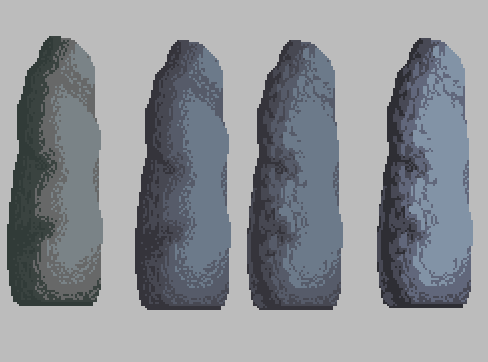
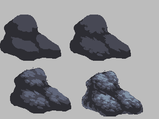
I've just begun to make some of my tileset for the first level and the first war god statue.


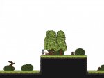
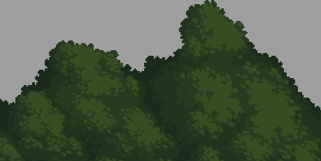
mockup of the first level I've started the background but I'm going to make the game 800x600 native, probably, I'll have to see what I'm comfortable with.

If there is anything people would like to discuss,give feedback or critisim, feel free.
 

Attachments

Kyrieru

Sensei
Joined
Dec 28, 2010
Messages
684
Reputation score
225
Re: UOU's Game devolopement area

Try to limit the number of colors you use to around 3-4 shades per color.


Fewer colors means less time coloring, more consistency, and too be honest it generally looks just as good.

Also, watch out for pillow shading on the post, and on the larger sprite.


Also, I feel like the amount of detail you're putting into the larger sprite makes her look a bit..."bone-y". (And also really time consuming to animate.)

Edit: Also the trees look somewhat out of place compared to the bushes.

Also I say also a lot.
 
Last edited:
OP
UrineOnU

UrineOnU

Cthulhu
Joined
Feb 2, 2011
Messages
369
Reputation score
40
Re: UOU's Game devolopement area

Try to limit the number of colors you use to around 3-4 shades per color.


Fewer colors means less time coloring, more consistency, and too be honest it generally looks just as good.

Also, watch out for pillow shading on the post, and on the larger sprite.


Also, I feel like the amount of detail you're putting into the larger sprite makes her look a bit..."bone-y". (And also really time consuming to animate.)

Edit: Also the trees look somewhat out of place compared to the bushes.

Also I say also a lot.
Yea its starts to get too the point where the sprites need to be always perfect especially with pixel art show how much practice i still need.

I'm not done with the trees though I spent too much time with the bushes they are going to be more leavey like the bushes and darker to match the other color pallets. the grass land tile is also subject to change but once everything else looks more consistent it'll be a little more in place.

The edits you made on the player sprite some I like, the leotard is going to be a different color than the greaves, and she has purple stockings don't know why the dark green is there but far away you don't really notice till close up.

Anyways got a lot more I'd like to look into and discuss but I gotta run for now, thanks kyrieru.
 

Kyrieru

Sensei
Joined
Dec 28, 2010
Messages
684
Reputation score
225
Re: UOU's Game devolopement area

The dark green is there because the green shade was so close to a black that next to purple it's perceived as black anyway. What it looks like zoomed in is less important than what it looks like zoomed out, more or less.

A good way of working with bushes and trees is to work in sections. Start with something divided into two "Sections" of shading.


Everytime you add another shade, make the shade another smaller "section"


It's handy because you can imply the shape of a tree, bush, and leafs without shading every individual leaf.
 
OP
UrineOnU

UrineOnU

Cthulhu
Joined
Feb 2, 2011
Messages
369
Reputation score
40
Re: UOU's Game devolopement area

The dark green is there because the green shade was so close to a black that next to purple it's perceived as black anyway. What it looks like zoomed in is less important than what it looks like zoomed out, more or less.

A good way of working with bushes and trees is to work in sections. Start with something divided into two "Sections" of shading.


Everytime you add another shade, make the shade another smaller "section"


It's handy because you can imply the shape of a tree, bush, and leafs without shading every individual leaf.
Yea i noticed the thing you did with the dark green right off, it works, so the dark purple is a color it could do without, I'll see how efficient i can make the sprite in a bit but I'm going for a darker pallet so it won't be as bright.

I have to do some tryouts with your tree technique, I usually use the base color for the entire thing first then the next then the next then adding the details but working in sections then putting it together might be something worth trying,probably quicker to finish in the end and more detailed.

I have much more to worry about than just these sprites but I'll still try getting the tone and look and feel right before moving on that way it stays consistent and i have something to fall back on if i stray off the path.
 

Kyrieru

Sensei
Joined
Dec 28, 2010
Messages
684
Reputation score
225
Re: UOU's Game devolopement area

Not quite what I meant,


Basically you draw a silhouette, and then rather than shading it as a single shape, you sort of divide it up in "as if" it were made up of multiple shapes.

Then rather than shading a bunch of small leaves, you sort of imply that they're there with the way you shade it. (Look at my previous screenshots for better examples of the final product.)
 
OP
UrineOnU

UrineOnU

Cthulhu
Joined
Feb 2, 2011
Messages
369
Reputation score
40
Re: UOU's Game devolopement area

Not quite what I meant,


Basically you draw a silhouette, and then rather than shading it as a single shape, you sort of divide it up in "as if" it were made up of multiple shapes.

Then rather than shading a bunch of small leaves, you sort of imply that they're there with the way you shade it. (Look at my previous screenshots for better examples of the final product.)
How long do you think we could talk about trees? Just curious?

It's just hard to word it right but I understood before but kinda didn't get everything exactly 100%, its similar to what i usually do the entire thing with the base color or as you say silouette, then separate it. This is where I always end up filling the entire space or doing too much, so that's probably where i go wrong, the depth gives the illusion that in the distance that's darker its just more of the shaded leaf detail that's closer when you shade it to simulate that. Basically i could use this to simulate a great many of things.

Anyways this is good learning, a lot of focusing on one aspect of artwork really improves your perception of the broader range it has to offer.
 

Kyrieru

Sensei
Joined
Dec 28, 2010
Messages
684
Reputation score
225
Re: UOU's Game devolopement area

Generally speaking, you shouldn't shade based on depth, you'll get what's called pillow shading (shown on the right)


Rather, you choose a direction and place the lighting and shadows based on the shape of the object. Unless you have a scene with a specific lightsource, generally you should have light coming from the top left or top right.

Shading based on depth is usually only used in something like this, where the shadows would otherwise be a bit flat.
 
OP
UrineOnU

UrineOnU

Cthulhu
Joined
Feb 2, 2011
Messages
369
Reputation score
40
Re: UOU's Game devolopement area

Generally speaking, you shouldn't shade based on depth, you'll get what's called pillow shading (shown on the right)


Rather, you choose a direction and place the lighting and shadows based on the shape of the object. Unless you have a scene with a specific lightsource, generally you should have light coming from the top left or top right.

Shading based on depth is usually only used in something like this, where the shadows would otherwise be a bit flat.
And this is why learning on my own didn't teach me many proper methods.

So yeah that makes sense, lighting is directional,so pillow shading should only really work if the light source is directly in front because it would only brighten the middle and not the sides thus shadows on both sides. So your sprite if facing right the light source is more likely to be facing it directly rather than behind unless your are in a cave entrance facing the dark side and the only light source is behind you.

I think I have some changes i could make that would benefit, this thread is getting very educational.
 
OP
UrineOnU

UrineOnU

Cthulhu
Joined
Feb 2, 2011
Messages
369
Reputation score
40
Re: UOU's Game devolopement area


Spent a hour or so revamping my tree still got some work to be done though, gonna go trim my bush while I'm at it so they look similar.
 
Last edited:

azurezero

Tentacle God
Joined
Feb 22, 2010
Messages
2,993
Reputation score
315
Re: UOU's Game devolopement area


Spent a hour or so revamping my tree still got some work to be done though, gonna go trim my bush while I'm at it so they look similar.
oh aye <3
 

Kyrieru

Sensei
Joined
Dec 28, 2010
Messages
684
Reputation score
225
Re: UOU's Game devolopement area


Spent a hour or so revamping my tree still got some work to be done though, gonna go trim my bush while I'm at it so they look similar.
Better, but you're still somewhat shading from the center. To show you what I mean...

(ignore the details, it's where the shadows are that's important)


Looking at the original, it's not really clear where the light source is coming from. (whereas the light on the trunk is clearly coming from the left.)

A more simplified example of where the shading would be,
 
Last edited:
OP
UrineOnU

UrineOnU

Cthulhu
Joined
Feb 2, 2011
Messages
369
Reputation score
40
Re: UOU's Game devolopement area

Better, but you're still somewhat shading from the center. To show you what I mean...

(ignore the details, it's where the shadows are that's important)


Looking at the original, it's not really clear where the light source is coming from. (whereas the light on the trunk is clearly coming from the left.)

A more simplified example of where the shading would be,
It's a habit I have to break, I'm still filling up almost all the space and two side shading in some places,not judging my stuff to the light source the way i should be. Yeah the lighter areas should be towards the left side because like you said the tree trunk is brighter there and obviously where the light is shininess the most.

Won't take long to get into my head though once i do it more than a couple times or get told a couple of times. If i could get the tree trunk sorta OK why not the top of the tree,ah the mystery of my brain.... I appreciate your time and patience with it.
 

kiko

aka the Asian rapper Kikkoman Flowsauce
Joined
Feb 18, 2013
Messages
1,735
Reputation score
844
Re: UOU's Game devolopement area

Heh, I already like this. And I love it how Kyri decided to help you with Pixel Art and that's a huge plus for him from me. Keep going UrineOnu, and try to acknowledge Kyri's tips, they will definitely make you a better pixel artist..
 
OP
UrineOnU

UrineOnU

Cthulhu
Joined
Feb 2, 2011
Messages
369
Reputation score
40
Re: UOU's Game devolopement area

Heh, I already like this. And I love it how Kyri decided to help you with Pixel Art and that's a huge plus for him from me. Keep going UrineOnu, and try to acknowledge Kyri's tips, they will definitely make you a better pixel artist..
Yea still learning to get it right and to do it more efficiently, made a rock like stone style pillar for the first area where the main characters statue is at the begging to try something a little different
.
 

Attachments

Kyrieru

Sensei
Joined
Dec 28, 2010
Messages
684
Reputation score
225
Re: UOU's Game devolopement area


Well, the first thing that looked off was the contrast of the bottom two tones. They're too dark compared to the brighter tones, and too close to each other.

Try and choose a fairly evenly spaced set of colors, getting a bit closer as they get darker.


Next is the shading. Generally speaking, shading with the whole spray-can tool look doesn't always work too well. The same sort of shading style you used with trees actually works fine on rocks, too.

The above one was just using a different "stroke" pattern, but we can apply a similar method as we did with the tree where it's divided into sections. start with a silhouette, and then imagine where there would be protrusions, and add highlights based on the light direction. Add a little less each time you add a new color.


And it goes without saying of course, but make sure to clean up any individual pixels that are out of place. I just didn't because it's a rough example.
 
Last edited:

Burningscarlet

Demon Girl
Joined
Nov 8, 2011
Messages
163
Reputation score
42
Re: UOU's Game devolopement area

Good feedback Kyieru :D

I'm learning a lot! I've always been so bad with the pillow shading problems...
 

NeithR

Jungle Girl
Joined
Nov 24, 2013
Messages
38
Reputation score
0
Re: UOU's Game devolopement area

Wow, Kyrieru tips are very useful :D
I have a lot problem when shading trees, stone, and nature-related things :D
I gonna try it too especially the shading method by dividing it into smaller section and then smaller section :D.
 
OP
UrineOnU

UrineOnU

Cthulhu
Joined
Feb 2, 2011
Messages
369
Reputation score
40
Re: UOU's Game devolopement area

Dam this environmental stuff is kinking me down in the dirt. Alright, got back from work so attempt number two is done I think the colors are more in tune now but my texture abilities are shit, probably put too much dark in the back too, but does it look more like a rock now rather than a half green rock with dots in places.
.

edit: OK so there's a big difference now
its staring to click and I'm liking the way it looks even more now.
 
Last edited:
Top