Kyrieru
Sensei
- Joined
- Dec 28, 2010
- Messages
- 684
- Reputation score
- 225
Re: UOU's Game devolopement area
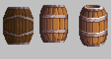
The shape of the metal going across the barrel doesn't really make sense. It might if you were really close to the object because of perspective, but even then the top doesn't have the same direction.
With this sort of thing, if you're showing stuff from a side view you should generally stick to a total side view, to keep things consistent. If you want to show something from the top or bottom, you have to adjust all the "arcs". By arc I mean like the bottom and top of the barrel, for instance.
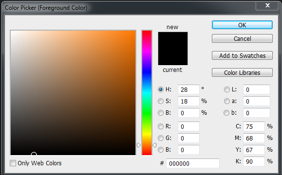
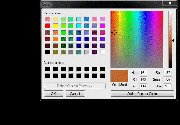
Also, with colors, a general rule of thumb is that bright colors have more saturation, and shadows have less. So in addition to brightness, lower or raise the saturation with each tone.
You can also shift the hue of your colors with each tone. In this example, 1 being the brightest tone.
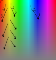
Common hue shifts are..
Red has orange highlights
green has yellow highlights,
blue has cyan highlights.
With shadows you almost always shift "towards" blue, because being a cool color it makes things appear to be farther back. So you're basically shifting your highlight from a hot color to a cool color.
The shape of the metal going across the barrel doesn't really make sense. It might if you were really close to the object because of perspective, but even then the top doesn't have the same direction.
With this sort of thing, if you're showing stuff from a side view you should generally stick to a total side view, to keep things consistent. If you want to show something from the top or bottom, you have to adjust all the "arcs". By arc I mean like the bottom and top of the barrel, for instance.
Also, with colors, a general rule of thumb is that bright colors have more saturation, and shadows have less. So in addition to brightness, lower or raise the saturation with each tone.
You can also shift the hue of your colors with each tone. In this example, 1 being the brightest tone.
Common hue shifts are..
Red has orange highlights
green has yellow highlights,
blue has cyan highlights.
With shadows you almost always shift "towards" blue, because being a cool color it makes things appear to be farther back. So you're basically shifting your highlight from a hot color to a cool color.